

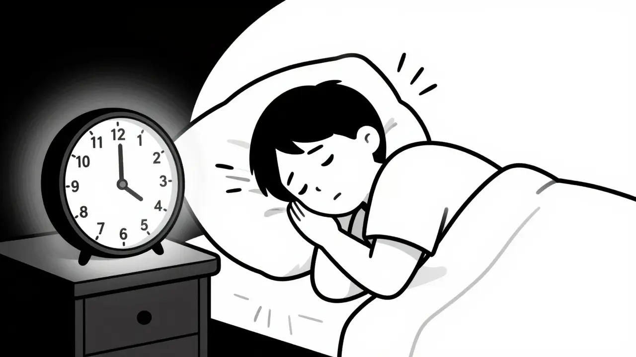
You picked up your prescription, opened the bottle, and stared at the label. It looked nothing like the last time you filled this same medicine. The font was smaller. The instructions were worded differently. The reason for taking it? Gone. Was this a mistake? Or is this just how it’s always been?
The truth is, there’s no single rulebook for what a prescription label should look like in the U.S. That’s why your bottle might say "Take one tablet by mouth twice daily" while the next person’s says "1 tab PO BID" - even if they’re taking the exact same drug from the same pharmacy chain. This isn’t random. It’s the result of a patchwork of rules, outdated systems, and state-by-state differences that leave patients confused - and sometimes, in danger.
Why Your Label Doesn’t Look Like Your Neighbor’s
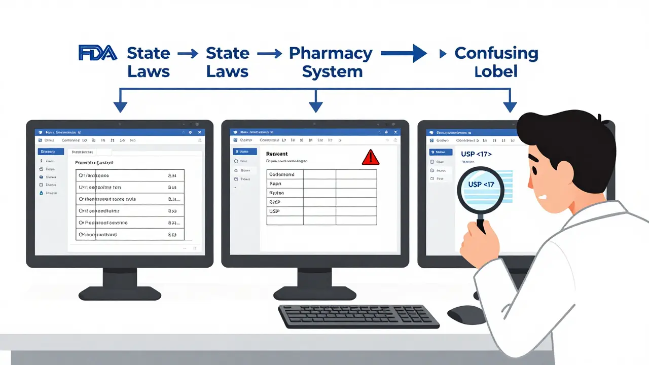
The U.S. doesn’t have one national standard for prescription labels. Instead, three different systems overlap and often clash. First, there’s the FDA. It sets rules for what drug manufacturers put on the professional packaging - the thick booklet doctors and pharmacists read. But those rules barely touch the little paper sticker on your bottle. The FDA only requires two things: the drug name and the "Rx only" symbol. Everything else? Left up to others.
Then there’s the USP General Chapter <17> a set of voluntary, evidence-based guidelines developed by the United States Pharmacopeial Convention to improve how prescription labels are designed for patients. Released in 2012, USP <17> recommends clear, patient-friendly labels: sentence case (like this), no all-caps, sans-serif fonts like Arial, black text on white background, 1.5 line spacing, and crucially - include why you’re taking the medicine. Instead of "for hypertension," it should say "for high blood pressure." Instead of "QID," it should say "four times a day."
But here’s the catch: USP <17> isn’t law. It’s a recommendation. Whether your pharmacy follows it depends on your state. Some states adopted it fully. Others added their own rules on top. Texas requires the pharmacy’s phone number to be printed in a font no smaller than 10-point Times Roman. California demands bilingual labels for certain medications. Ohio has different spacing rules. And in states that haven’t adopted USP <17> at all? Labels can be a jumble of abbreviations, tiny fonts, and missing information.
The Real Cost of Confusing Labels
It’s easy to think, "I’ll just ask the pharmacist." But most people don’t. A 2021 survey by the National Community Pharmacists Association found that 68% of patients had trouble understanding their prescription labels at least sometimes. And 22% said they’d made a mistake because of it - like taking too much, too little, or at the wrong time.
One Reddit user shared how they took double their prescribed dose of a blood thinner because the pharmacy changed the label format between refills. Last time, it said "Take 1 tablet twice daily." This time, it said "1 tab q12h." They didn’t know q12h meant every 12 hours - not twice a day. They ended up in the ER.
That’s not rare. Between 2019 and 2022, the Texas Pharmacists Association logged 417 medication errors directly tied to confusing labels. That’s 18% of all reported errors in the state. Experts like Dr. Michael Cohen from the Institute for Safe Medication Practices say standardizing labels could cut medication errors by 30-40%. That’s not just a number - it’s fewer hospital visits, fewer deaths, fewer families shattered by preventable mistakes.
Why Don’t All Pharmacies Just Use the Best Design?
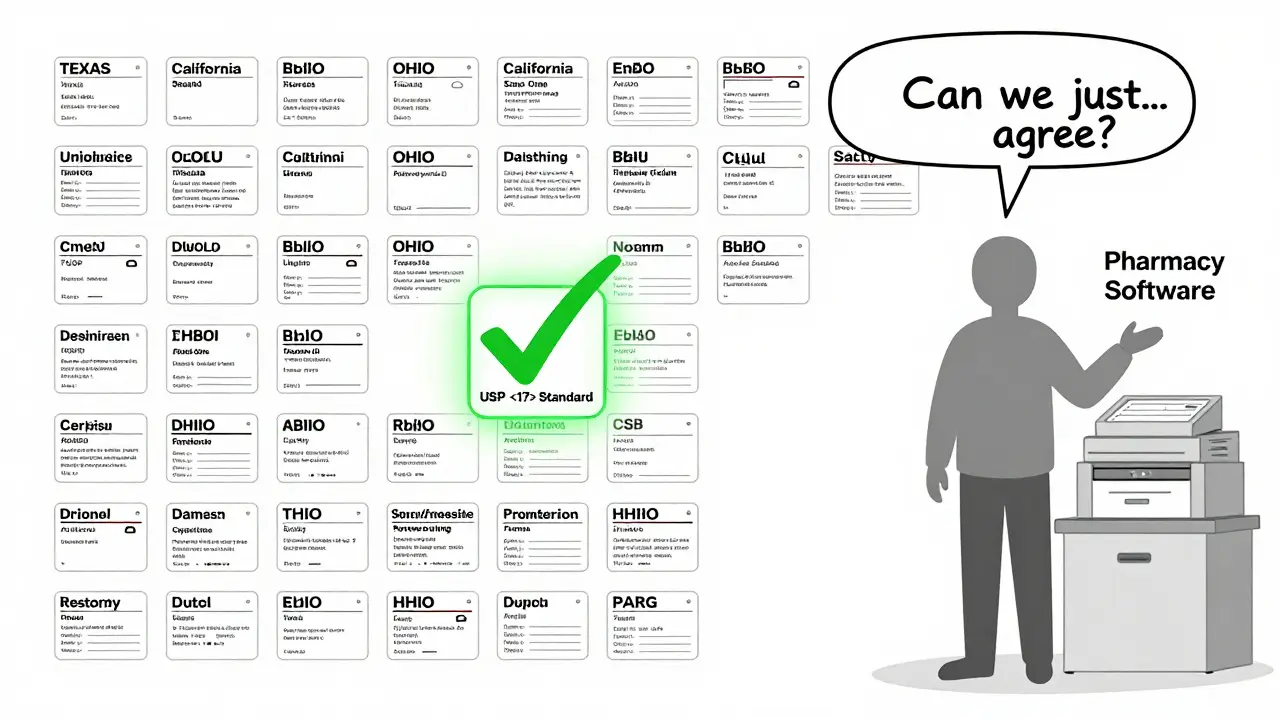
Because changing a label isn’t as simple as updating a logo. Pharmacies use dozens of different computer systems - over a dozen major ones nationwide. Each system formats labels differently. Switching systems costs hundreds of thousands of dollars. Training staff, redesigning templates, reprogramming printers - it adds up. One pharmacy chain estimated it would cost $5,000 per location to fully adopt USP <17> standards.
And then there’s the legal maze. Pharmacists have to follow FDA rules for professional info, USP recommendations for patients, and their state’s own rules - sometimes all three contradict each other. A pharmacy in New York might print a label that’s perfect under USP <17> but violates a Texas rule about font size. So they default to the strictest local rule - and that means labels vary even within the same chain.
A 2022 audit by the American Pharmacists Association found that only 38% of pharmacies consistently offered large-print labels. Just 12% offered braille. Five percent offered audio labels. That’s not because they don’t care. It’s because the systems they use weren’t built to handle accessibility options. And if you don’t ask for them, you probably won’t get them.
What’s Changing - and What’s Not
There’s movement, but it’s slow. CVS Health announced in April 2023 that it would roll out USP <17>-style labels across all 10,000+ of its pharmacies by December 2024. They ran a pilot in 500 stores and saw a 33% drop in patient questions about labels. That’s a win.
Other chains are watching. The Biden administration’s 2022 Patient Safety Action Plan set a goal of 90% state adoption of standardized labeling by 2026. So far, only 28 states have adopted USP <17> in some form. Just 15 have fully implemented it.
The FDA took a small step in June 2023 by releasing draft guidance on improving patient understanding of prescription labels. But experts say any real federal mandate is still years away. The pharmacy industry resists. The cost is high. The rules are tangled. And until every state and every pharmacy system gets on the same page, your bottle will keep looking different.
What You Can Do Right Now
You don’t have to wait for the system to fix itself. Here’s what works:
- Ask for a plain-language version. Say: "Can you print this in simpler words? I want to make sure I’m taking it right."
- Request large print. Most pharmacies have the option - you just have to ask. Some even offer labels on clear plastic strips you can stick to your fridge.
- Use your phone. Take a photo of your label. Use a translation app to read abbreviations. Many apps can convert "q6h" to "every 6 hours."
- Check the reason. If the label doesn’t say why you’re taking the medicine, ask. Knowing it’s for "anxiety" instead of "for GAD" makes a huge difference.
- Compare refills. If your label changes between refills - font, spacing, wording - speak up. It’s not normal.
Medication safety shouldn’t depend on which state you live in or which pharmacy system your pharmacist uses. The science is clear: simple, consistent, patient-centered labels save lives. The technology exists. The standards are proven. What’s missing is the will to make them universal.
Why does my prescription label look different every time I refill?
Your label changes because different pharmacies use different computer systems, and those systems format labels differently. Even if you go to the same pharmacy chain, switching between systems (like during a system update or location change) can alter font size, spacing, abbreviations, or even the order of information. Also, if you refill in a different state, state laws may require different information to be included.
Is there a federal law that says what must be on a prescription label?
The FDA requires only two things: the drug name and the "Rx only" symbol. Beyond that, federal rules focus on professional labeling - the detailed info for doctors and pharmacists. What patients see on their bottle is mostly controlled by state pharmacy boards, which vary widely. Some states require pharmacy phone numbers, others require bilingual text, and some have no specific rules at all.
What is USP <17> and why does it matter?
USP General Chapter <17> is a set of voluntary, research-backed guidelines created to make prescription labels easier to understand. It recommends using plain language (like "take once a day" instead of "QD"), clear fonts (Arial, not Times New Roman), black text on white, 1.5 line spacing, and including the reason for taking the medicine. Pharmacies that follow it see fewer patient errors and fewer phone calls asking for clarification.
Can I get my prescription label in large print or braille?
Yes - but you have to ask. Most pharmacies have the ability to print large-print labels or offer audio formats through apps or phone services. Braille labels are rarer and usually require advance notice. The Access Board requires pharmacists to offer these options and explain them to patients with vision or reading difficulties. Don’t assume they’ll offer it - request it.
Why don’t all pharmacies use the same label design?
Because pharmacies use dozens of different software systems, each with its own label template. Changing to a standardized design means upgrading software, retraining staff, and paying for new printing setups - which can cost thousands per location. Many pharmacies also have to follow conflicting state laws, making it harder to adopt a single national standard. Until regulations align and funding becomes available, variation will continue.
If you’re tired of guessing what your label means, you’re not alone. Millions of people are. The fix isn’t complicated - just consistent. Clear language. Clear fonts. Clear reasons. And for once, the system should work for you - not against you.


10 Comments